
If Apple could make headphones feel like a considered, premium object through scroll interaction — why couldn't we do the same for a medical device that genuinely improves people's lives?
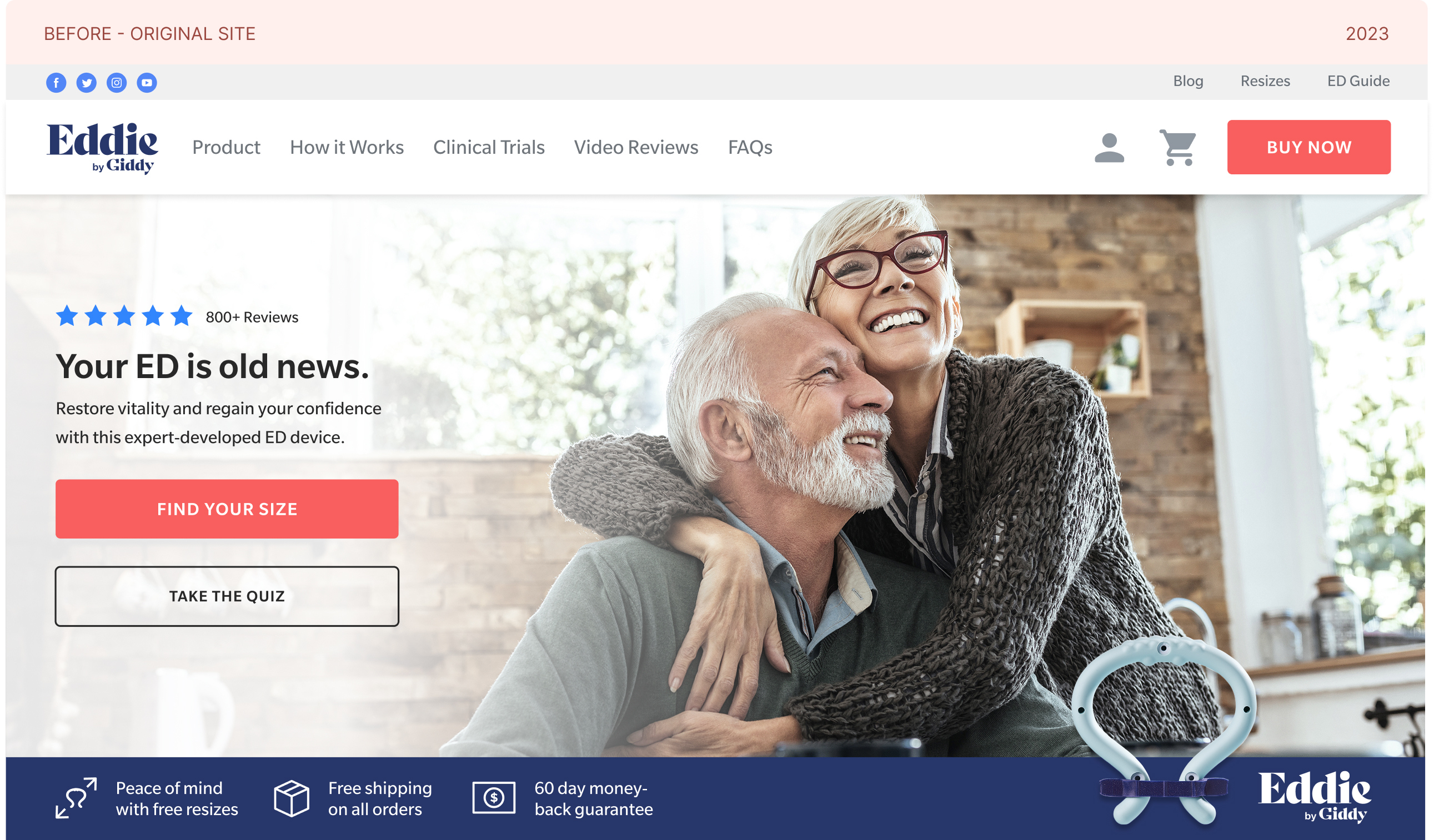
Started with a take-home assignment redesigning their actual PDP. Hired within a week. In my first week on the job, Katie and I redesigned two pages of the Eddie by Giddy site. Got familiar with the product, the brand, and the team fast.
In my first week, Katie and I were already redesigning pages. But the harder question was what "premium" actually looked like for an intimate health product. I started looking outside the category entirely. Apple's AirPods Max PDP specifically. The parallax scroll, the section reveals, the way it made headphones feel like a considered object. I brought the reference to Harrison with a proposal for a quick internal user test. The team validated it and we moved into design.
Working with Katie and reporting to Harrison, we shipped two complete redesigns within 5 months — built around the parallax direction. New UI patterns, updated components, improved information hierarchy. Email campaigns tied to the new site drove traffic and began moving conversion metrics.
The email program connected to the redesigned site drove meaningful engagement. 100+ emails designed for a 50K+ customer base, reduced bounce rates, and improved conversion. The work was showing in the company's numbers and team morale.
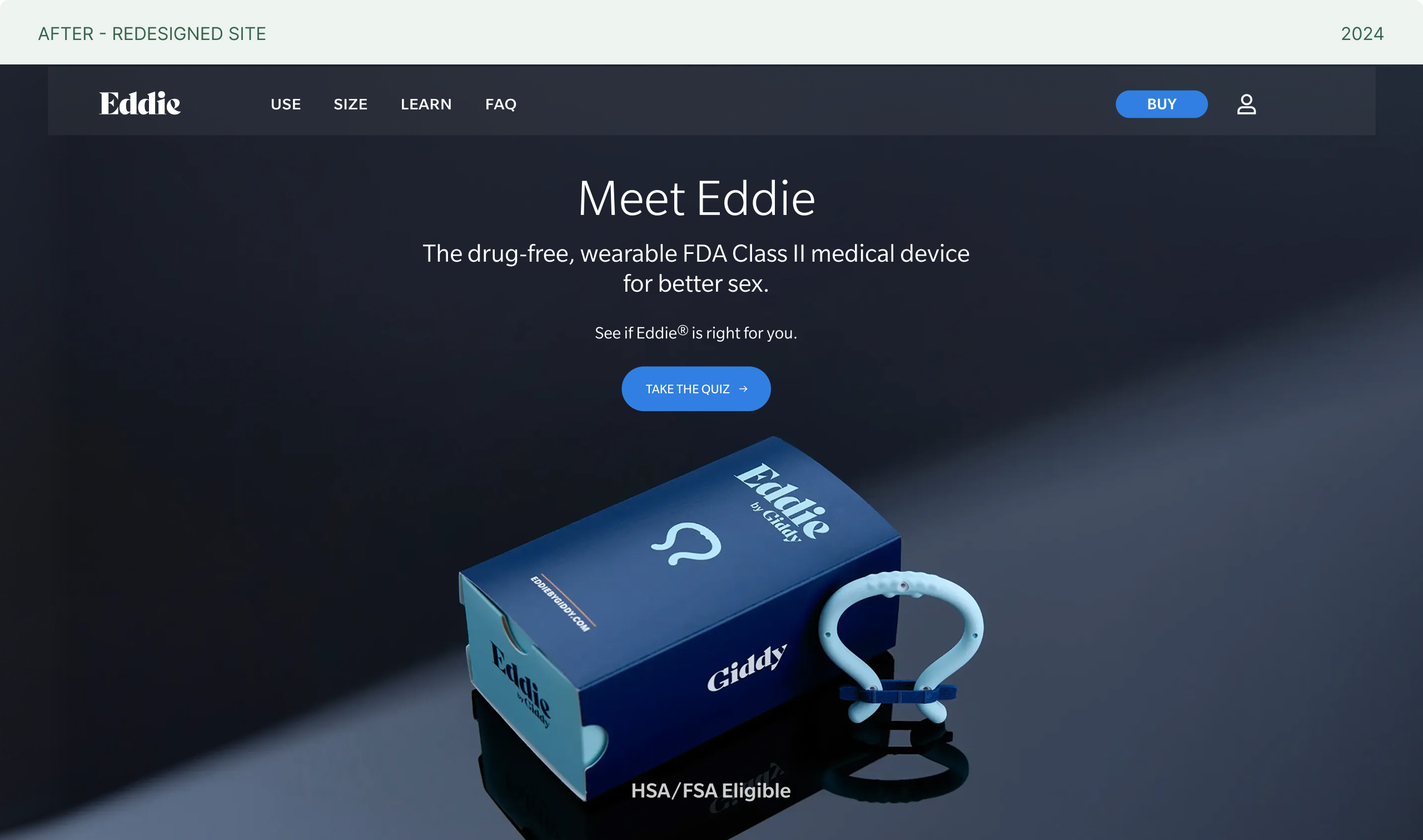
The new team, Eugene (VP of Design) and DM (Art Director), came in with a clear goal: don't just refresh it. Reimagine it. But the creative foundation was already there. The Apple-inspired parallax direction had been tested and validated in Phase 01, and it survived the restructuring intact. Phase 02 wasn't about finding the answer. It was about executing it at a higher level of craft and ambition.
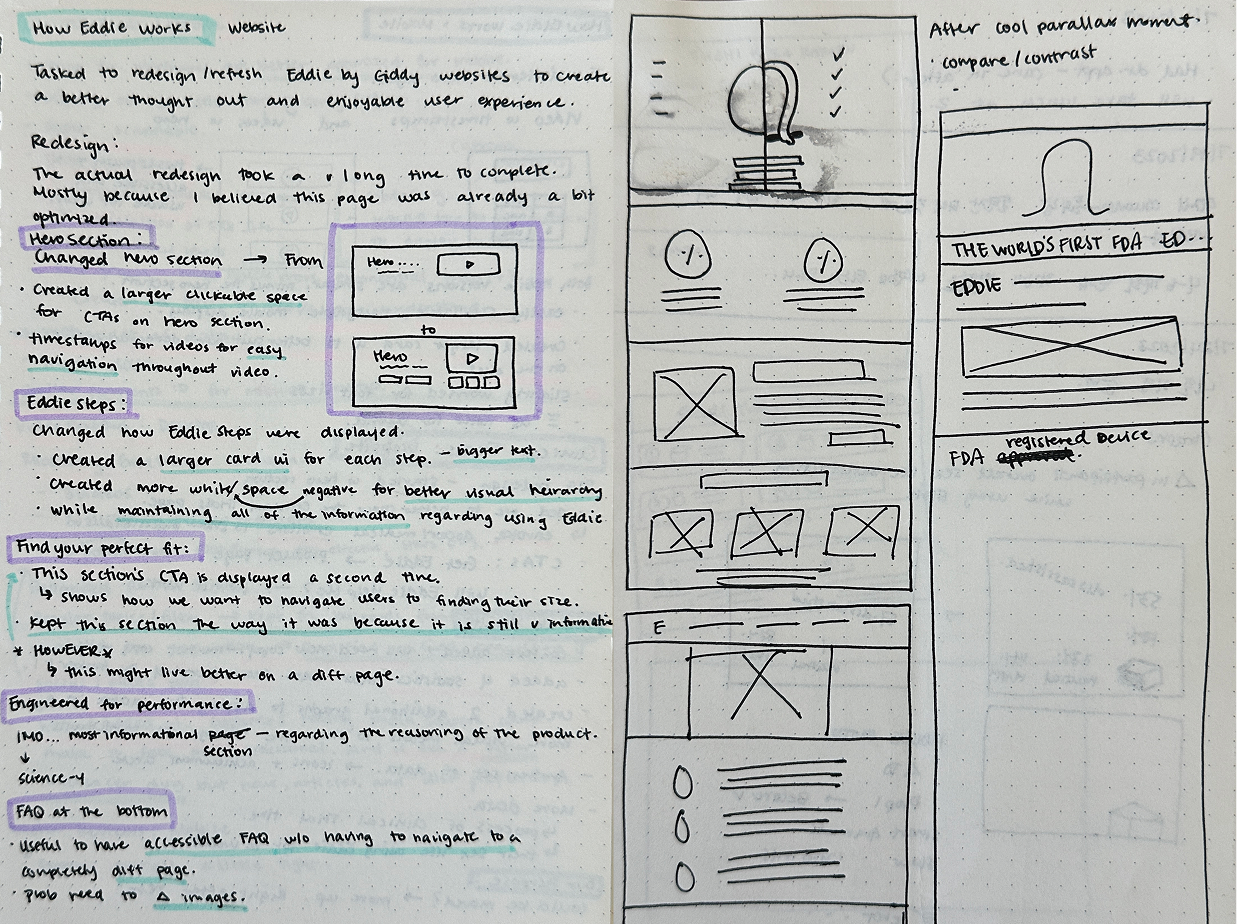
I owned the design end to end. Wireframes, high-fidelity mockups, and interactive prototypes while simultaneously handling requests from paid advertising, email marketing, and engineering. The parallax scroll required trial and error to figure out, pre-AI tooling.
The layered parallax design created real engineering complexity. After several rounds of handoff and iteration, we made a practical call — ship two versions simultaneously and let the data decide. Version A (parallax), Version B (video embed).
Both versions went live simultaneously. A series of email campaigns introduced the new brand feel and drove traffic to the redesigned site, reinforcing the funnel consistency we had designed for. Post-launch: 28% traffic increase, 129% lift in user engagement within two months.
Scroll hacking experience — each section reveals on scroll with layered depth. The design direction inspired by Apple's AirPods Max PDP.

Video embed in place of the scrollhack — same visual language and brand elevation, implemented through a series of video instead of scroll interaction.
The parallax wasn't just a homepage decision. it ran across the PDP and all landing pages linked from email campaigns. This created a consistent premium experience across the entire funnel from email click to purchase decision.
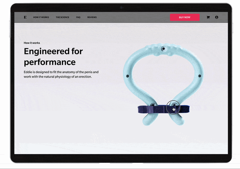
We identified sizing confusion as the primary driver of drop-off and returns. Built a sizing chart, visual aids, how-to guide, and video tutorial directly into the PDP, addressing the root cause rather than the symptom.
PDP and email landing pages shared the same visual system and scroll experience. Users moving from email to site felt a seamless, premium experience. Reducing the cognitive gap between ad and product page.
The most important design decision wasn't visual. It was benchmarking against Apple, not other health brands. That reference gave the team a shared, concrete vision of what "premium" actually meant for this product.
The most important design decision on this project wasn't a visual one. It was the decision to look outside the category for inspiration. Healthcare and sexual health products tend to look like healthcare and sexual health products — safe, clinical, cautious. Apple doesn't make health products, but they know how to make someone feel like what they're buying is worth it.
Bringing that reference in, testing it with the team, and building conviction around an unconventional direction before a single frame was designed — that's what made the project work. The parallax scroll was the thing people noticed. But the real work was everything underneath it — the sizing solution, the funnel consistency, the handoff precision — that made the numbers move.
I also learned something about pragmatism. Shipping two versions instead of waiting for perfection wasn't a compromise — it was the right call. Real user behavior told us more in two weeks than we could have predicted in two months of design reviews.